OVERVIEW
Bookmark bars in any browser get unruly. Links might save well in Pinterest, but how will those integrate with files in Google Drive? Enveloop solves a major flaw from which most cloud storage systems suffer, instead empowering users to store and organize content seamlessly. Cataloging inspiration from any source, right alongside the working files they inspire, is essential for any creative endeavor.
As my solution, I defined the design and brand for this SaaS web app, allowing users to store files, save links, create simple text documents, and collaborate. All in one place. Read on to see how I’d like to “loop” people into a new way of accessing everything that’s most important to them.
THE PROBLEM
Users were looking for a cloud storage option that offered them more control.
PROJECT REQUIREMENTS
- Users should register via a marketing landing page.
- Users should navigate their account content within an organized dashboard experience.
- Users need the ability to share any content seamlessly with collaborators.
- Users need the ability to choose between three subscription levels.
ENVELOOP'S SOLUTION
USER RESEARCH: FINDING A UNICORN SOLUTION
COMPETITIVE ANALYSIS
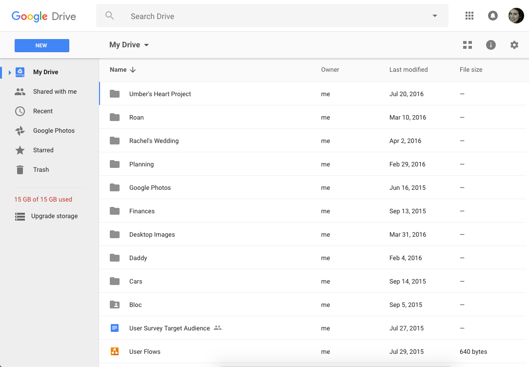
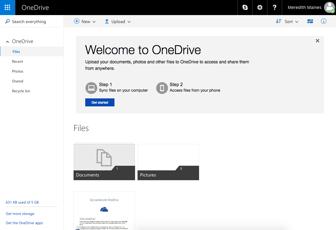
I completed a SWOT analysis of three other cloud/online-storage solutions: Microsoft Office Online, Google Drive, and Pinterest. All three offer the ability to save and share content. From this exercise, for my product to be able to compete in the market, I determined my product should be device-agnostic, retain full functionality across any platform, and capitalize on the opportunity to streamline processes such as sharing and commenting.
VIEW THE ANALYSIS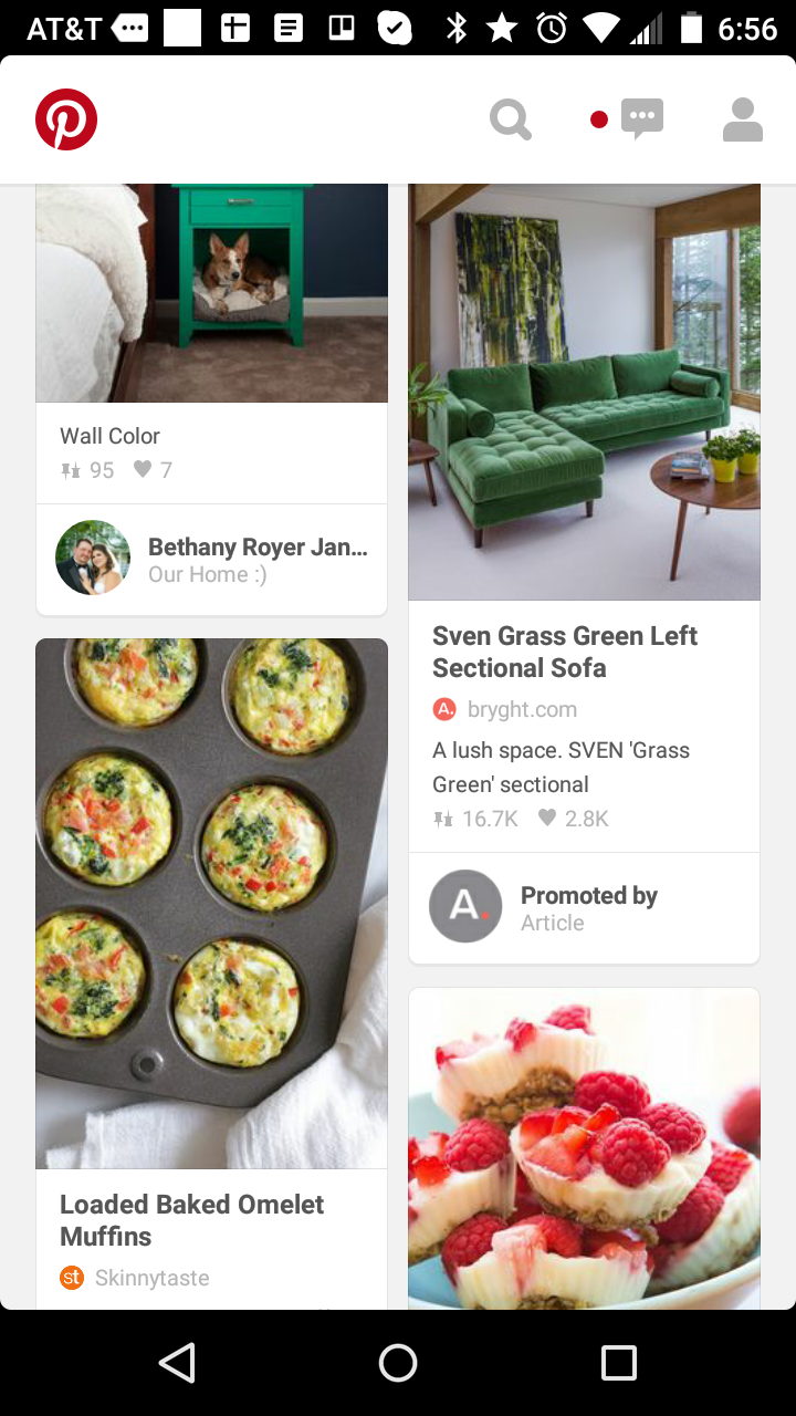
SURVEY
Though this project lacked budget, I corralled 40 friends and family members to steer the research, through surveys, interviews, and usability tests. While building the survey, I learned the value of skip logic and crafting a shorter survey to minimize bounce rate among participants.
VIEW THE SUMMARY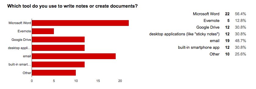
PERSONAS
The target audience for this project is frustrated by digital clutter. They clearly voiced a preference that their ideal product should feature elegant filtering tools and be streamlined to a refined set of tools.
VIEW PERSONAS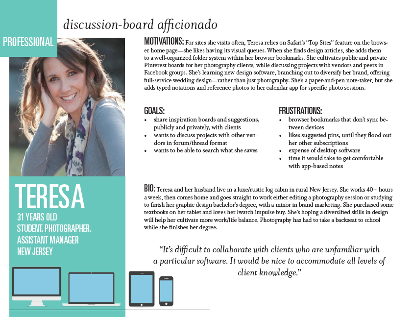
USER FLOWS
User flows defined the true scope of what I needed to build for the first testable version of the application. To fully launch this project, I would need to work closely with a developer to analyze these flows based on the platform’s database.
VIEW SELECTED FLOWSUPDATING THE LOOK
LOGO
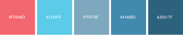
I was tasked with generating a name for this product that clearly and cleverly captures the app’s ability to create documents, store/organize files, and share them—or “loop” people in. The logo is a simple line illustration, to convey the ease with which users can enjoy the product. The motion of the line conveys action, productivity, and speed of sharing. The line is open, to convey the ability to welcome other people easily into collaborative projects stored within. The color inspiration came from the ruled lines of notebook paper.

JUST MY TYPE
For typography, Merriweather’s serifs are sturdy, displaying dependability—something valuable in a productivity app. Its letter forms are open, connoting approachability. Robot’s sans serif friendly, open curves allow for a natural reading rhythm perfect for body copy.
VIEW TYPE STUDY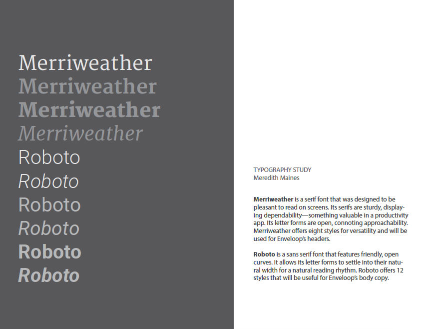
ITERATING THE ISSUES
FIRST PROTOTYPE
I wanted to test the landing page design to see which features potential users would most react to, at which price points. I also knew I wanted to see how an entirely horizontal navigation design would fare against users’ familiarity with the leading Google Drive. I recruited participants to be recorded in a moderated usability test, using a clickable InVision prototype and a tailored testing script based on best practices from Steve Krug.
After seven usability tests with the first prototype, I gathered many takeaways. My main action items were to refactor the titles of main navigation items to better communicate action, tweak some of my branded terms (“tag,” “envelope” v. “folder”) for clarity, and streamline sharing options on the share modal.
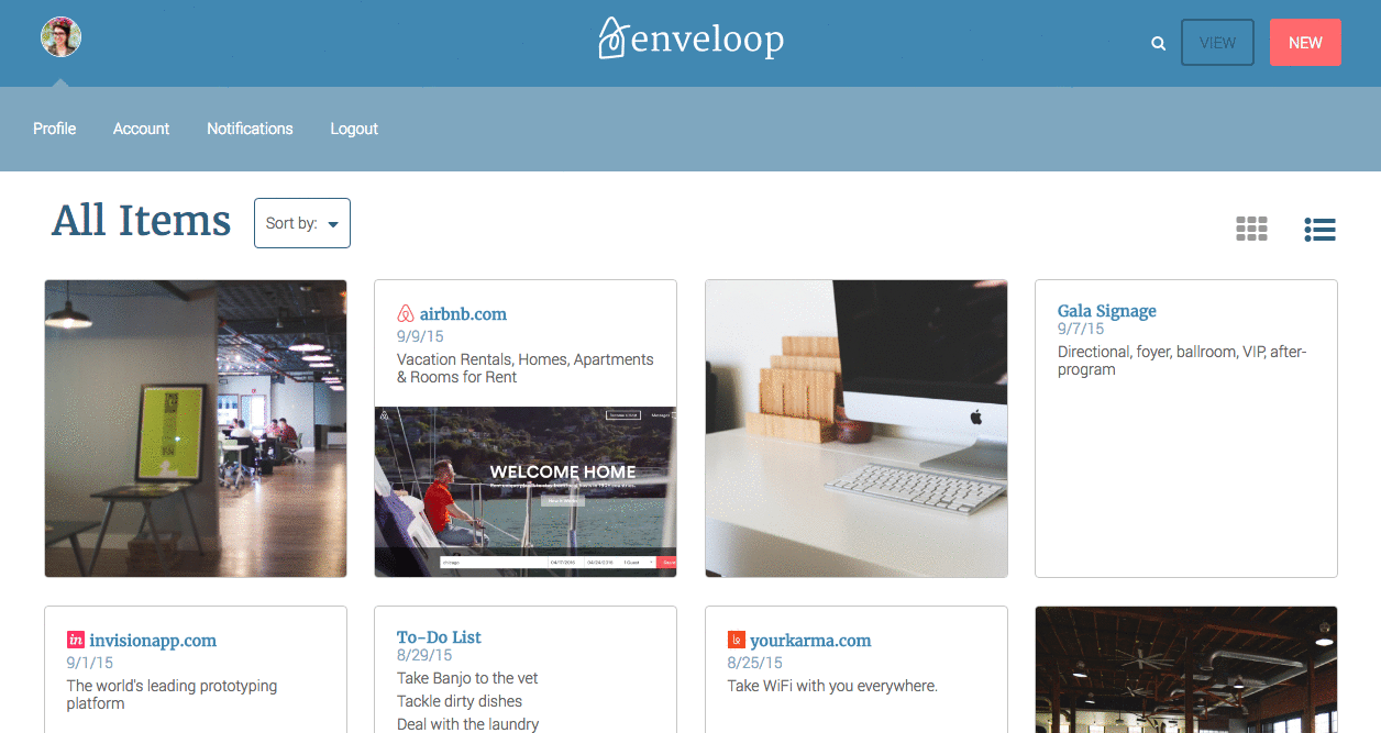
VIEW FIRST PROTOTYPEPROTOTYPE DASHBOARD
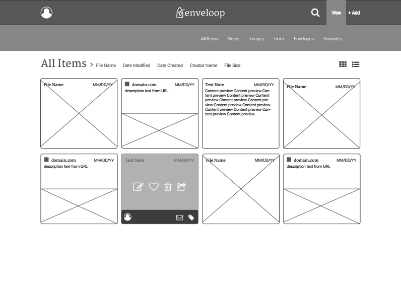
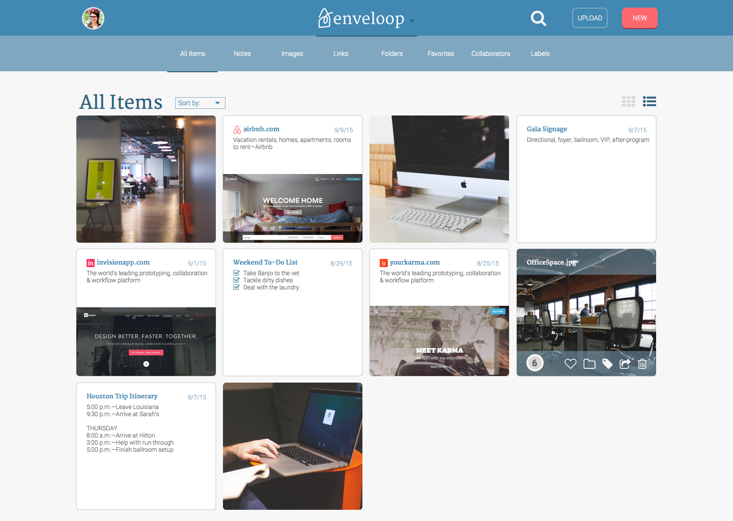
MOCKUPS
After performing usability tests with my mockups and utilizing usabilityhub.com's free preference tests, I landed on this iteration.
VIEW DASHBOARDNEW DASHBOARD NAVIGATION
KEY LEARNINGS
I was challenged by the scope of the web app and by time constraints that only allowed me capacity to build the landing page and one dashboard view. This project taught me the hard way not to think of mockups at just one size—design mobile first!
I also learned the importance of deciding buttons’ hover, clicked, and active states in the mockup stage so I don’t have to make those decisions on the fly in development. Also, so that when working with a full-time developer, I’d be able to provide accurate documentation.
With more time, I’d like to continue updating. First, based on my five-second tests of the landing page on Usability Hub, I’d revisit the hero image/copy to better communicate user goals. On the landing page, I’d also add a “tour the features” button that leads to a page with a video demo of the app.
Within a user’s account, I’d want to further explore the way content is displayed in the dashboard list view. Since visual recall is important to the user base, I want to ensure that visual display isn’t compromised just to save space.