PASSION PROJECT // CASE STUDY
shreve memorial library site redesign
MOVING PUBLIC LIBRARIES CLOSER TO ONE-CLICK SHOPPING
VIEW PROTOTYPEOVERVIEW
We all wish we had more time to read. What if your local public library's site were as simple to use as your favorite online stores? All the time you used to spend navigating a frustrating website could instead be put toward enjoying content.
When it comes to public libraries, a better online experience equals more free reading, watching, and listening. In short, more bang for your taxpaying buck. Read on to see the improvements made to Shreve Memorial Library's website.
THE PROBLEM
The library’s e-branch staff hope to increase traffic and conversions on the local library system's website. Because the library is a public institution, its online offerings must appeal to users, no matter their demographic. This makes audience targeting, especially for patrons who are less internet-savvy, a real usability challenge.
PROJECT REQUIREMENTS
- users should be able to easily register for a library card online.
- users need the streamlined ability to search the catalog and filter results, withouth the jarring redirect experience from local site to catalog CMS.
- users need the ability to browse content related to their interests.
- users need to receive personalized recommendations to increase their visit frequency.
AFTER
USER RESEARCH: THEIR STRUGGLE WAS REAL
COMPETITIVE ANALYSIS
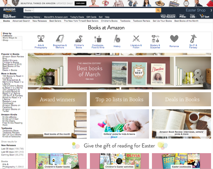
I completed a SWOT analysis of Shreve Memorial Library, two other public libraries, and Amazon.com’s landing page for books. Public library sites can exhibit a similar user-task flow to the online purchasing process, so I wanted to examine the for-profit, e-commerce trends found on Amazon.com.
From this exercise, I determined I needed to survey users about:
- how they wanted to control their view of search results
- their current frustrations with the search process
- How they browsed, or would like to browse, content online—and even in person on the shelf
SURVEY
I leaned on the 284 responses I received to my national survey, posted on several topically applicable sub-reddits. By surveying a national audience, I aggregated a common thread of user motivations and expectations: easy catalog searching, staff recommendations, streamlined site navigation.
VIEW THE SUMMARY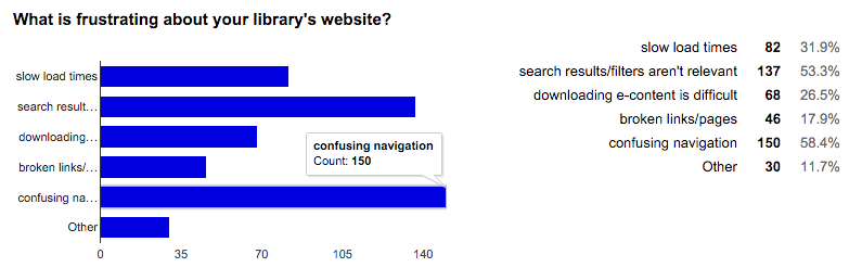
PERSONAS
From the six one-on-one interviews I performed, I identified three major categories of library site users: the working parent, the casual professional, and the avid learner. Overall, these target audiences are frustrated by the inability to refine search results or land on a browse page targeted to their interests.
Each group wants a clearer idea of how long they’ll have to wait before their desired material is available. These interview-informed personas also helped me identify several features to implement in a second phase of development.
VIEW PERSONAS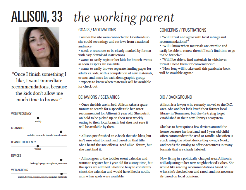
USER FLOWS
User flows helped me identify areas where I’d need further information from library staff to coordinate with their database capabilities. I knew I would need to learn more about the external online catalog service used by the library and how it could be customized with code without interrupting the display of results.
VIEW FLOWSUPDATING THE LOOK
LOGO BEFORE
The library’s existing logo was designed as a nod to the parish’s local Red River, but it did not have an approachable, welcoming sense and was also hard to place.
LOGO AFTER
For an updated logo, I pulled from another familiar Louisiana motif—the pelican. I wanted to use an animal character to add personality—approachability and friendliness—to the library system.
I created a suite of pelican marks that can be reduced to two colors or one, depending on production requirements. The bird sits on a book with curved pages as a nod to the local waterway.
LOCAL COLOR
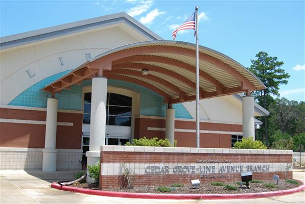
To take the existing logo in a different direction, my color inspiration came from the branch buildings themselves. I used a color picker on photos of local library branches, then extrapolated a color scheme from this jumping off point.
For typography, I again referenced the local branches’ outdoor branding and went with an all-caps serif font for the title in the logo.
Martel has large counters and bowls that lend open, approachability, and its descenders and terminals are open as well. It has a traditional feel without being stuffy—perfect for a public community service—for use in headers.
Open Sans is optimized for print, web, and mobile interfaces, and has excellent legibility characteristics in its letterforms; I’ve implemented it as body copy and within form fields. Legibility is very important in this project because it needs to appeal to all demographics.

ITERATING THE ISSUES
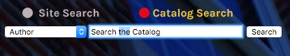
SEARCH BAR, BEFORE
The existing site’s search bar required several clicks to even complete a search. The homepage search bar defaults to site search and has a small target area to toggle between site and catalog search. The style of the catalog search bar is different than the site search bar.
It also decreased in size, making the targeting area even smaller. The explainer text has to be manually deleted, and the search button has to be manually clicked with the mouse instead of being activated by “return” on the keyboard.
PREVIOUS SITE SEARCH BAR
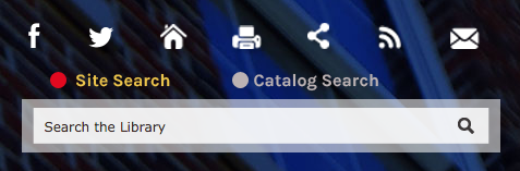
PREVIOUS CATALOG SEARCH BAR
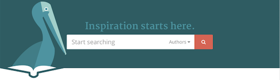
SEARCH BAR, AFTER
The search bar on the current site is in the right corner, but on my redesigned homepage, I wanted to elevate the importance of search, since that’s the purpose of most users on the site, based on my survey responses.
My design iterations moved the search bar to the middle of the homepage’s hero section and eventually address the target area’s sizing. I eliminated the ability to search the site because it was not a goal of my survey respondents, but it could easily be added to the search dropdown if there is a public outcry.
NEW SEARCH BAR
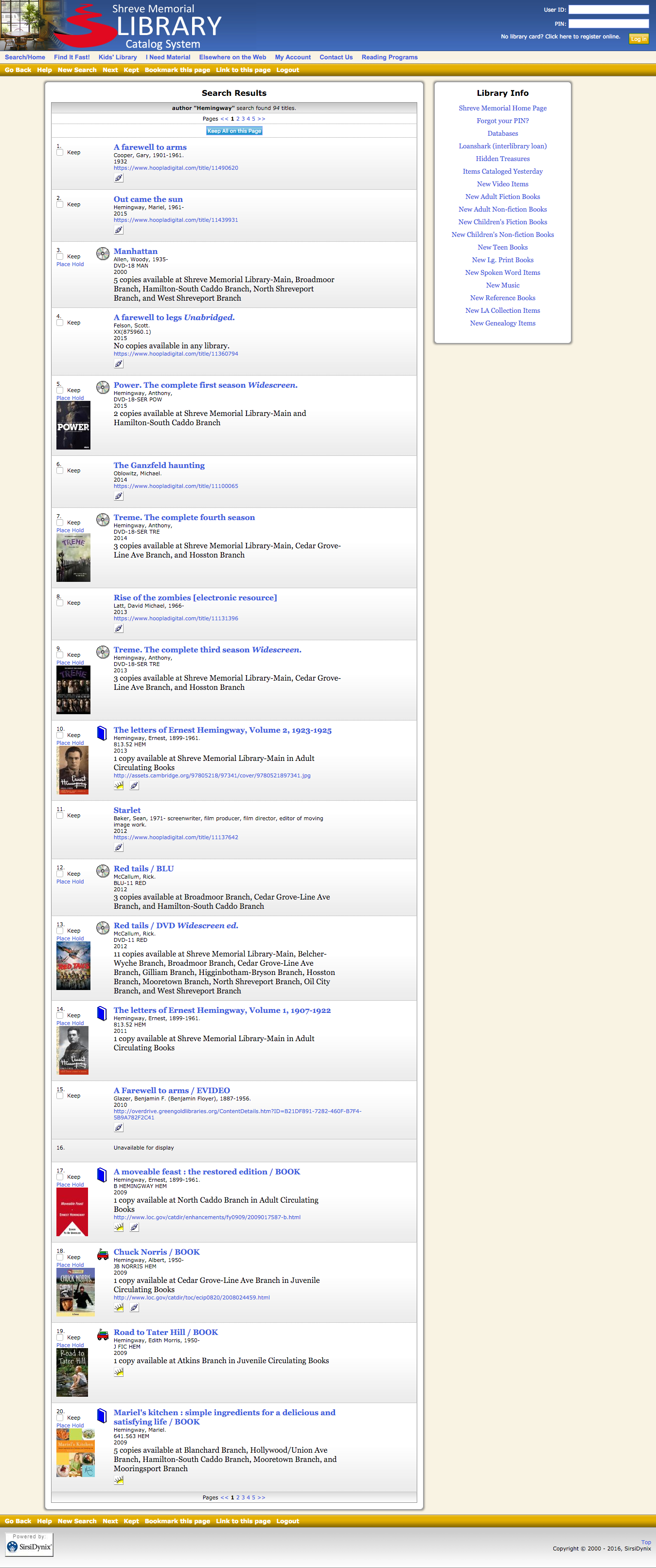
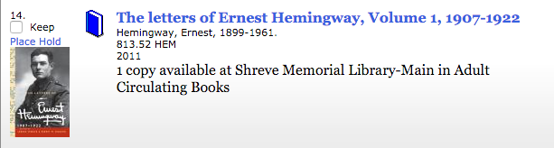
SEARCH RESULTS, BEFORE
On the existing site, the search results page can’t be sorted or filtered. The existing site’s search result pagination target area was very small. The existing site’s search results page needed a better way to immediately see which titles and formats are available now.
PREVIOUS SEARCH RESULTS BAR
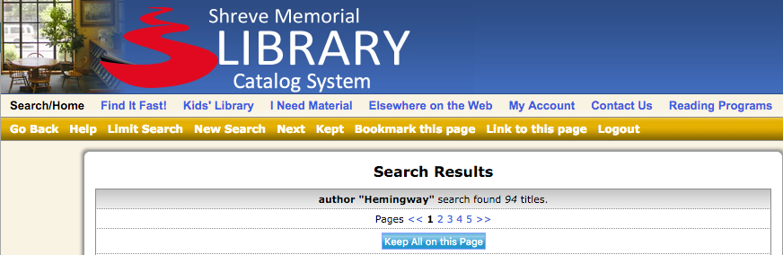
PREVIOUS SEARCH LISTING
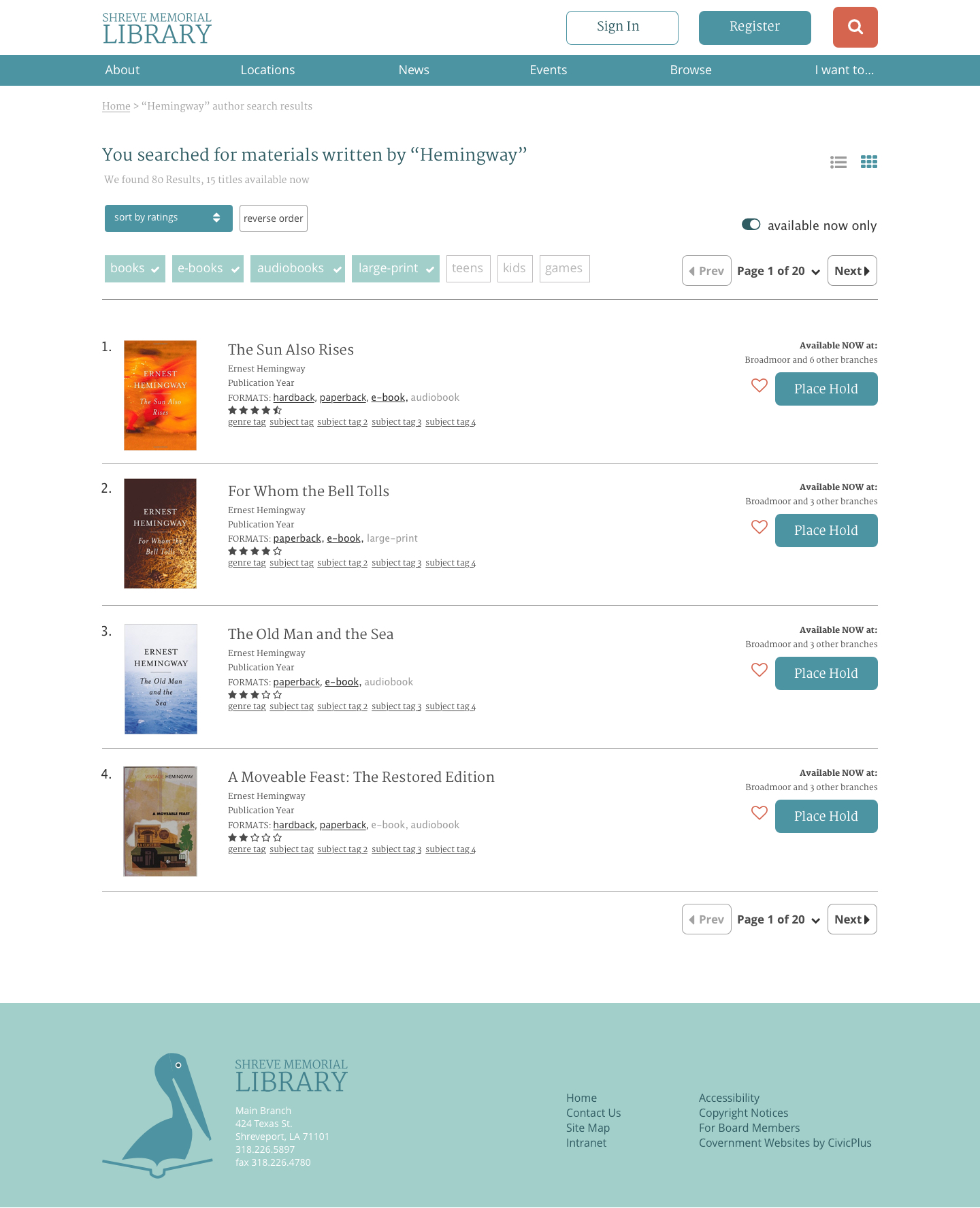
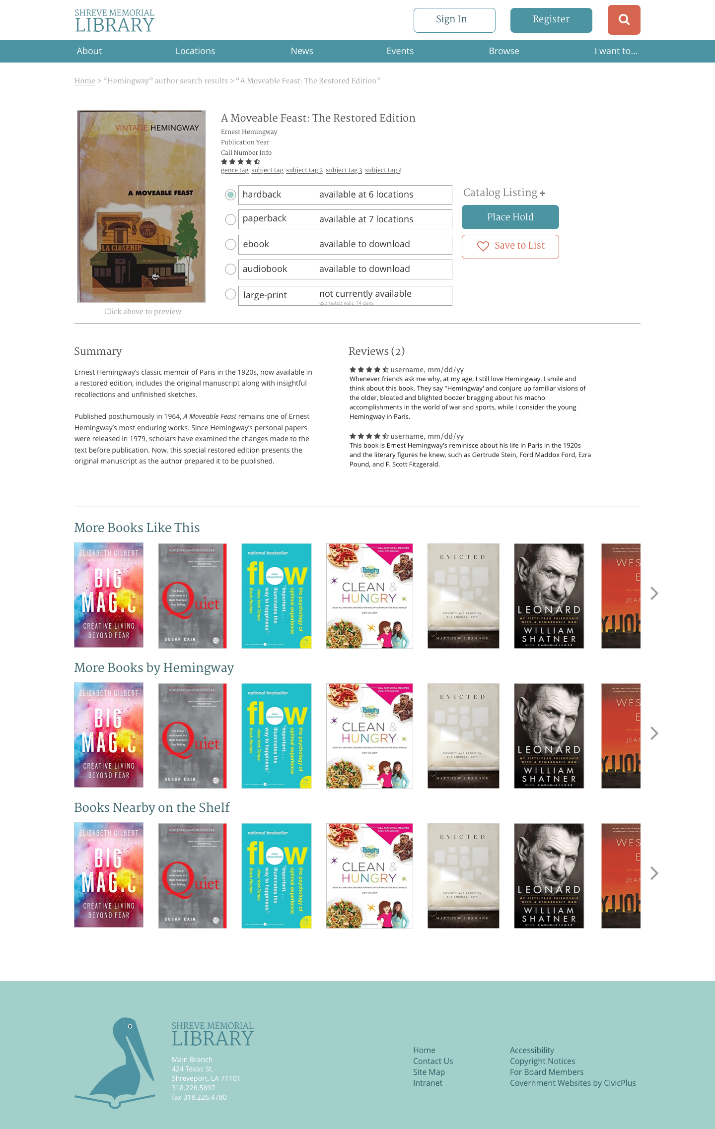
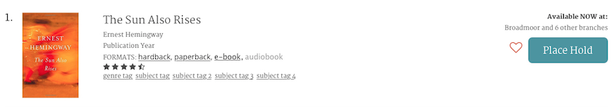
SEARCH RESULTS, AFTER
In my redesign, I added the ability to filter by format, age group, and availability, and to sort alphabetically, by ratings, and published date. I also added a headline that positions the search results in user-centric language.
I landed on a solution that allows skipping from previous and next, to selecting the exact page you want from a dropdown. I displayed one list result per title, then listed available formats as links and unavailable formats greyed out. This reduces the number of list results, which should decrease decision making time.
I also made it easier to place a hold (similar to a “buy now” button). I created the ability for users to save an item to a favorites list. I also added ratings to these list items to make choosing a quality item easier at a glance. The entire item area (between ruled lines separating list items) could be clickable to increase target area, instead of requiring users to click directly on the title.
NEW RESULTS FILTER SYSTEM
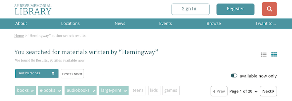
NEW SEARCH LISTING
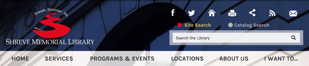
NAVIGATION, BEFORE
From my conversations with library web staff, I learned “I want to…” was added as a catch-all for users who needed alternative ways of locating site actions. I kept this sub-navigation menu item since staff felt it was effective.
After observing a local branch’s community internet class, I learned that the in-branch audience needs buttons and search fields to be accentuated for ease of use. Because they are not as comfortable with technology, the instructor needs to be able to say “the orange button in the right corner” or “move your mouse inside the box that says ‘username’.”
PREVIOUS SITE NAV
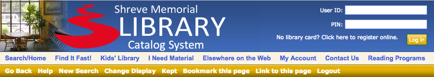
PREVIOUS CATALOG NAV
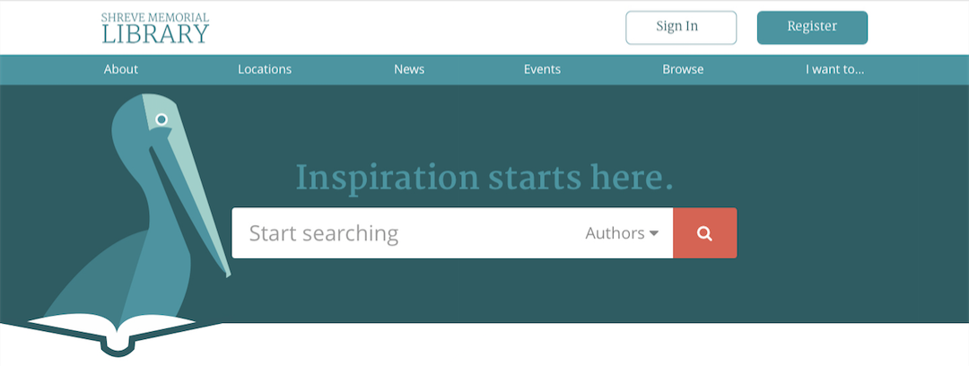
NAVIGATION, AFTER
I wanted to have a global navigation that followed the user, no matter which portion of the site they visited. The user doesn’t need to deal with the complexity behind the catalog CMS. The user just wants a seamless experience.
On the redesigned homepage, the search bar is in the hero section, so a search button is not included in the main navigation. On all other pages, the orange search button jumps to the outer edge of the main navigation for easy recognition and accessibility.
Once signed in, the top nav shifts to include an account name button, that when clicked, expands and additional tertiary account nav. On mobile, the nav would collapse to a menu button.
NEW HOMEPAGE NAV
NEW GLOBAL PAGE NAV

NEW ACCOUNT NAV

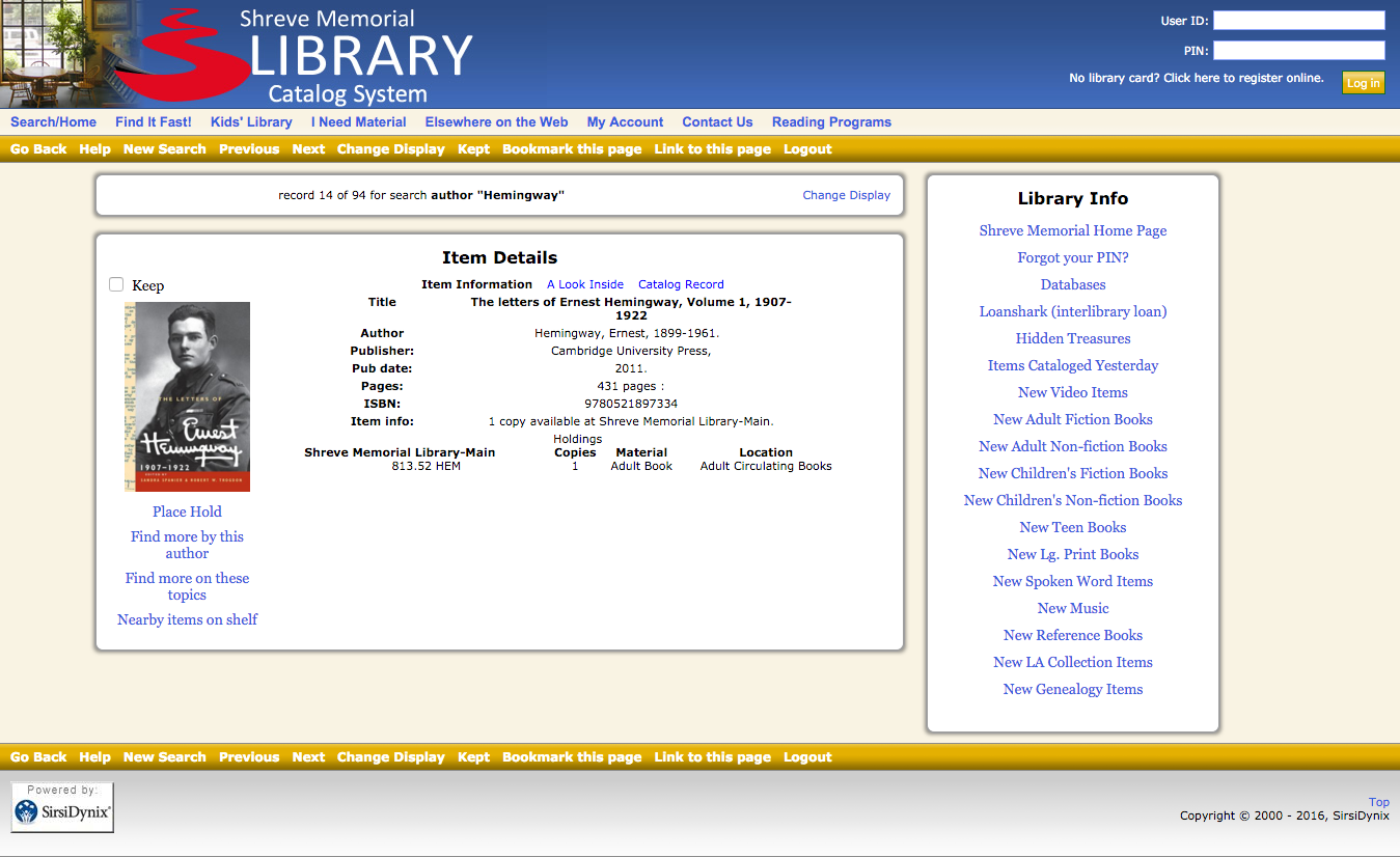
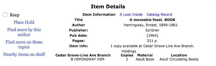
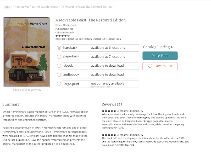
PRODUCT DETAIL PAGES
I streamlined the ability to preview an item’s first pages (similar to Amazon). I added a section for nationally aggregated ratings and reviews and streamlined the ability to view a summary and recommendations based on various item criteria.
I also gave users the ability to specify which format of a title they’d like to save or reserve, directly from the product detail page, with visible availability as paramount to decision making.
BEFORE
AFTER
KEY LEARNINGS
From my conversations with the library staff, it seems as though little demographic or user-behavior data is currently being captured. Any of my redesign recommendations would need to be implemented through the lens of conversion-rate optimization—iterative tests with a single variable tested against a control.
In addition to using UserTesting.com and UsabilityHub.com, user testing could be conducted in-branch, even during one of the community internet classes, to get a local common denominator for usability.
Because of the necessity for a lower common denominator to accommodate the in-branch audience that’s less familiar with technology, I recommend extra time be spent on determining clear hover states for entire divs and clear click states for buttons and within navigation.
With more time, I would want to tackle the site’s event calendar to make it filterable based on age group, location, or time of day.